


About Melissa’s Website Zhooshing

melissa’s brand vibe:
what she needed:
honest, genuine, approachable, authentic
something “hip, smart” with more “chillax” to it
What are your favorite things about your new website?
It utilizes my brand colors and updated images to match the energy of my pictures, my brand, and me. Sarah helped ME be more upfront (rather than hiding behind my training or licenses) by adding more pictures of me than I previously had. She also helped me expand my blog by using visually stunning images, something I had not considered before. Finally, I have a bright, clean new design rather than a dusty lampshade of a design.
Melissa’s Old Website
What She Wanted:
An “airy” and light website
Something that felt approachable
To use the same blue but to add more vibrancy

Where We Started:
Melissa’s website had been hacked, and since it was hosted on Wordpress (a fairly complicated platform) she couldn’t fix it on her own. She decided it was the perfect time to move to an easy-to-use hosting platform so she could edit on her own AND get a refresh at the same time.
Because she had recently hired a copywriter for her website she didn’t need completely new copy, but she felt some of the language didn’t capture her well. While she wanted to keep most of what the copywriter had done for her, she asked for help making some changes to specific areas.
Her website and logo had been designed years ago and and while she loved the colors and the logo (a geometric dandelion) she felt it wasn’t as bright and inviting as she wanted it to be. She asked to keep the basic color palette but to make it feel more “airy.”
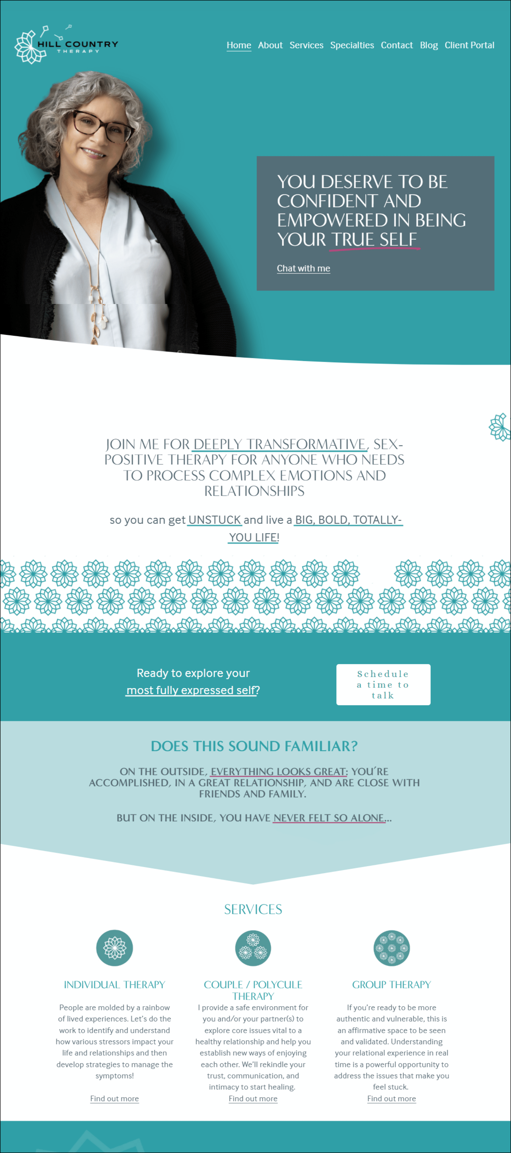
Melissa’s New Site
by Make My Practice Better
What We Focused On:
Melissa had two pictures of herself on her old site and none of them were easy to find. We took advantage of her awesome new headshots and made sure people would feel her vibe through the photos sprinkled throughout her website.
I added a bright white, a blue-gray, and a pretty maroon to the color palette so the website would have more pop and contrast than her old site.
We added backgrounds and borders that used her logo throughout the site to give the page more texture and interest.
We reworked her opening sentence to help her better capture the feelings she wants her clients to leave her work with.
“Sarah is AMAZING to work with. She has a fantastic trademarked process to get to the heart of what you want for your website. She goes above and beyond by introducing tools, tips, and knowledge that expand your websites capabilities.”
— Melissa
What did she end up purchasing?
The Make My Website Better package
A la carte additions of specialty pages and services pages
The addition of an “About Me” page (the package includes an “About Me” page OR a blog page)